Color is a new mobile location based photo app that lets you share photos with people around you. There's no need to follow friends because the social connections are based on distance. I like the concept - viewing real-time collections of photos from people experiencing one event like a party or gig. Color also lets you to shoot video, something I'd love from Instagram.
It reminds me of a live Beastie Boys performance shot entirely by audience members called Awesome; I Fuckin' Shot That released a few years back.
The problem is using Color is an awful experience, I didn't really understand what I was doing half the time. Navigating the app is confusing because the icons are too abstract and every screen has different vertical and horizontal layouts. It's not just me, no one in the office using Color could figure out if they were in a stream, a profile or a group.
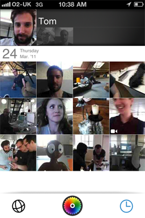
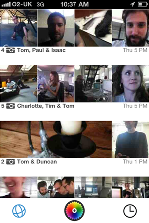
The first time I loaded Color it took me a while to realise that I had to touch the spiny colour ball icon to get started, I thought it was loading. This is a superfluous screen thats not needed, why not take me straight into the app, with a blank state screen explaining what I can do.
Color's obviously trying to do something different to Instagram and Path, but the service doesn't need this abstract and arty interface, especially if they hope to get millions of users.
