Creating on-brand iconography
Over the years, I’ve been challenged with designing several icon sets for totally new and established brands. Whenever I start concepting and designing a new icon set, there are a few lenses I use to approach creating on-brand iconographic systems.
I’ve found these constraints and rules have helped me create consistency across large scale icon sets, that feel an integral part of the product and brand.
–
Create a design system
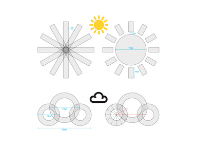
When creating large icon sets, create a design system that fuses consistency across the entire set. When I was bringing back and modernising the classic BBC Weather icon set at my previous role, I had a fantastic brand heritage to work with.

But to start, I tackled the two symbols that were repeated the most within the set - Sun and Cloud (clouds are, of course, a staple of British weather).

Creating a design system based around angles of 30 degrees helped to establish rhythm and consistency between all of the symbols. All the elements and cuts within these symbols adhered to this 30 degree rule. Once these two icons were locked down, the rest of the set revolved around this theme.
–
Borrow from other branded assets
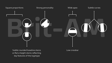
When working with an established brand - interrogate their current brand assets, taking cues from them to leverage within your icons. This is where I started when designing an icon set for ITV News. I looked towards their custom font Reem for inspiration.

The squared proportions, subtle rounded baseline stems and flat x-height tops proved fertile ground to weave the ITV brand throughout the icon set.

The icons weight and proportions were directly taken from the font. I introduced the same typographic quirks into the icon set to make sure that the icons felt a part of the ITV family. When seen in the context of the app interface, these quirky branded icons make that connection between icon, font and interface.
–
Tie all the brand elements together
Creating totally new propositions and brands from scratch provides a unique opportunity to design a truly harmonious product. One where brand marque and interface elements all work together to influence each other - including the iconography.

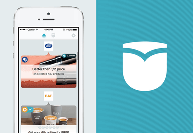
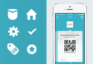
In this example for a loyalty app we designed, the marque was directly influenced by distinctive interface elements. This in turn influenced the icon set which helped tie the whole product experience together. Rounded corners and tear drop shapes were all jumping off points to thoroughly integrate the brand into the suite of icons.

This level of brand cohesion could only be achieved by developing the interface alongside the identity.
–
Ultimately, creating icon sets is about creating uniformity: each icon should be consistent with the rest in the set. However I strongly feel it pays off to craft icons with a consistent brand running throughout. As who knows, in the future these icons may need to stand alone, outside of the interface or service for which they were originally designed. That’s when they will have to represent the brand all on their own.
Further reading / resources
History of Icons
Icon design workflow
The Icon Handbook
Optimising UI icons for faster recognition
Continue reading
7 things we learnt taking Hackaball to Kickstarter
Following some amazing coverage in The Economist and Creative Review this month, we're also very excited to be featured in the next issue of Offscreen Mag...
Maintaining culture while embedded
At Made by Many we believe in working extremely closely with our clients. So closely that our NYC studio regularly sends teams to work from within our cli...
What you might not know about retail, but should
The future of retail has some interesting twists and turns ahead, many of which aren't immediately intuitive. Here are at least eight that you should know...


