Designing for long-term success with a mental health app
How do you encourage users to keep logging their meals, calories and mindful minutes when the real result only shows in the long term?
BRIDGE partnership is a group of consultants empowering managers and employees to create better workplaces. After 25 years of running workshops and training a large number of employees in the world’s biggest organisations, they were looking for digital opportunities. The goals were clear: not only should that ‘opportunity’ help them scale and leverage their experience, it should also help them deepen the impact they can create in those organisations. The consultants love nothing more than supporting clients in their development, but were constrained by their own time.
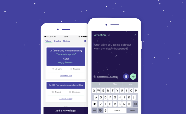
The result is ‘Realist’, a mental health app allowing employees to develop strategies that help them deal with stressful situations. After an initial workshop with one of the coaches, delegates are asked to download the app on their personal phone. The wonderful voice of Jane (Global Capability Director of BRIDGE) leads delegates through a guided reflection session, pushing them to challenge their own thinking and note down the things they would do differently in the future.
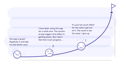
Like many other apps in the same category (mental health, fitness, dieting) Realist faced a challenge: since it’s not until later in the use of the app that we see concrete results based on inputted content, we risk losing users before the app shows its true value. Apps in this category demand a lot of initial commitment. How many sessions in meditation apps like Headspace does it take before someone actually starts feeling any effects? The more a user puts in, the more and sooner they will get something out of it. So how did we design an experience that’s valuable from day one? How did we encourage users to keep on adding these entries without seeing the long term value?
Once the initial promise of ‘Realist’ was proven in our first round of user research, we spent eight weeks designing and building the first version. The sooner BRIDGE partnership could share the app with their delegates, the sooner we could start learning how to improve. The features included: a wizard to add your ‘triggers’ (things that set you off), a simple way of looking back at them and an initial reflection audio, asking users to write down their thinking. In this pilot BRIDGE partnership shared ‘Realist’ with 60 delegates all over the world. After a few weeks using the app, we started a round of in depth interviews. Figuring out what’s working and what’s not, and most importantly, why.
As with most apps, we witnessed a drop-off rate in use. Nothing really surprising. However, when we started talking to some of the users and asked why, we were in for a surprise. It seemed like some delegates stopped using the app itself, but kept stepping through the ‘reflection’ in their head. They had been running through the reflection audio guide enough to remember the routine off by heart. The daily reminder to reflect (notification) was enough of a prompt to answer Jane’s questions, without the need to even open the app.
In some ways we can look at that as a success. It shows that the app helped employees to put the techniques in practice, but we also assume this fast learning user has the potential to learn a lot more over time.
It is all about the journey, not the destination
Each time someone records a ‘trigger’ they step through the same audio guide. After each reflection, a user ends with a list of clear actions to help them cope with similar events better. The trigger is processed and therefore ‘done’ from a user’s perspective. Once you understand the reflection routine, there is no incentive to go through all the typing on your phone over and over again.
However, once you are in that routine, that’s when the learning and growing actually starts. The way BRIDGE’s consultants experienced it in their workshops, it is the actual logs that users type during the reflection that hold ‘the real gold’. Coming back to them later on, and seeing those logs in relation to each other over time helps users spot commonalities in the things they tell themselves. It is that deeper level of self-confrontation that is needed to approach those returning, dwelling thoughts with a fresh perspective. It is that realisation that helps you develop more meaningful strategies that work for each type of situation.
But when users leave the app before they have the right amount of content to see those patterns, what do you do in between? How do you keep a user’s attention in this awkward phase where he/she feels he learned everything, while there is still a lot to learn? What’s the incentive to carry on?
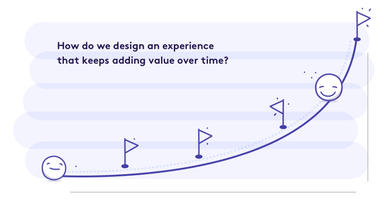
Try to put yourself in their shoes. We have probably all used DuoLingo or Headspace. How many times did you plough through German lessons that just kept repeating the same words before you gave up? We want to impress our friends straight away. We all want quick results.
Apps like these are competing for our attention on a daily basis and use all sort of motivators to get you in a daily routine. Special mini challenges, badges, dynamic content that changes every time you open the app... But what do you do when you want to spend your time as efficiently as possible, when there are probably a lot of other features that need attention at the same time? What minimal experiments can you introduce to lock a user’s attention? And most importantly, how can you make the experience valuable from day one? The promise of ‘Realist’ proved really successful so far and we’ve been lucky with how much we’ve already achieved in the pilot. We’re just about to embark on some more experiments, here’s a little snippet of what we’re going to test:
1. Get rid of notifications. As long as there is nothing new to explore, don’t try to lure users in your app with false promises. Almost no one reacted to our ‘daily reminders’ and a big percentage even found them annoying. To make notifications work the user needs to feel he/she set the timing on their own terms. Make the timing and pattern of the notifications easy to edit.
2. Re-state the long-term goal upfront as often as possible. Try to remind people why they should keep adding entries, and what the ultimate outcome of the app is: a more confident you. We used each opportunity to subtly remind people of the long term goal: a bit of encouraging text on an empty state of a screen, icons that illustrate that end goal…
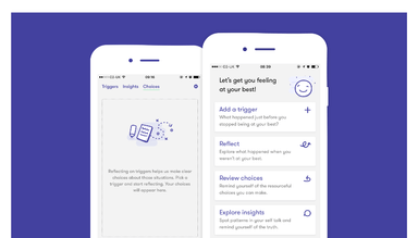
3. Highlight the user’s effort: surface and repeat the effort people put in as much as possible. Each entry in ‘Realist’ is presented back in cards. This allows users to easily review and track their progress, hopefully encouraging them to do better. Experiment with short summaries, reward users even for small steps of progress or repeat some of their ‘strategies’ in a notification. This small ‘mantra’ will remind them of the work they put in and hopefully encouraging to add even more.
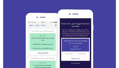
4. Don’t demand perfect entries. Apps like Headspace know we aren’t fully trained Zen Buddhist from the get-go. They even leave room in their first sessions for wandering thoughts. In the ‘Realist’ we try to lower the threshold for new entries as much as possible. A lot of people held back on adding triggers because they assumed some weren’t ‘dramatic’ enough to process. In the end it’s all about practice and the sooner we have more content, the better. We added simple example events to set the tone, leaving no ambiguity to add lots of triggers.
5. Simple isn’t simple enough. Setting 10 minutes aside on a daily basis may sound like a low commitment. We shrunk a 30-minute session into 10 carefully designed minutes, but user’s busy life asked for even less. A shorter reflection session was number one on people’s wishlist in testing. There are tons of technologies out there that could make this a flawless journey (voice recognition for example), but with a limited budget we are forced to consider each step even more. The plan now is to add in a ‘quick reflection’, giving them room to come back to their choices later. Hopefully this will get them to the optimal amount of entries a lot faster.
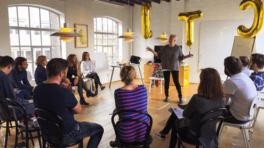
6. Get people to motivate other people. Realist is first introduced to delegates in an immersive workshop. They go through the experience with Jane in front of them. Nothing motivates more than other people’s energy. We have learned that even the most motivated people get stuck sometimes, especially on a topic like mental health, that’s why delegates now can get in touch with a coach straight from the app!
Hopefully we will be able to share the results of some of these experiments soon. In the meantime, we are always open to learn more on this topic. Working on similar challenges? Get in touch at letsmeet@madebymany.com !
Continue reading
The “cost” of diverse teams
Diverse teams produce better results. But no one said this is without a cost.
Three questions to ask yourself, before speaking to your users
It’s not enough to just tick the box of ‘talking to users’ and think that doing so will mean we magically end up at the right product. We need to think cr...
