The Chameleon Effect: Designing products that users can relate to

You’ve probably experienced this: Listening to someone who has a different accent than you, maybe when visiting another country or watching Goodfellas for the 3rd time in a row, and you find yourself unconsciously mimicking the speech and behaviour of the people in front of you.
As a Canadian living in London, I see myself do it all the time. I’m often mocked by my own parents for adopting words and pronunciation used by the people around me. I smugly inform them that mimicry is in fact a way of showing empathy and affiliation with other people: we copy one another’s behaviour to show that we understand each other. It shows that we are paying attention and that we care. Psychologists have coined a name for it: The Chameleon Effect. At this point my parents mention that it’s getting late and they should probably be getting to bed.
As Nir Eyal wrote in his book “Hooked”, unfamiliar products and interfaces are more difficult to use and can impede adoption. At Made by Many we always aim to make products that are useful and usable, but if you know your users well enough you can use design and language to add a level of familiarity by mirroring a little bit of their behaviour back at them, and establish a more personal connection between your users and your product.
Getting to know your users
At Made by Many user testing is absolutely vital to guide the direction of all of our projects. It’s vital for guiding the direction of the product, validating decisions we’ve made and informing future work. However I think it’s often taken for granted that while we’re speaking to users to validate hypotheses or identify opportunities, we’re also learning about their personalities, the unique ways they use language, and what they have in common with other users of your product.
These seemingly small details are hugely valuable when designing what the user sees. Small observations like whether they say “Yes” or “Yeah” can be mirrored back to them, and make the difference between whether the copy on a button sounds like their friend or their boss.
One product we’re working on right now is an internal app for the employees of our client, the majority of whom are millenials. In user testing we learned that the employees predominantly use private Whatsapp groups to communicate with one another. Curious about the kinds of things our users were saying, we asked to be silent observers of their internal Whatsapp groups, and because millennials are famously unconcerned with their digital privacy, they obliged.
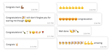
What we saw was that this particular group of users were outstanding visual communicators. They’d congratulate each other by sending avalanches of emojis, or answer questions with memes. Snapchat-style images with text slapped at jaunty angles onto blurry photos are all over the place. If they did write anything it was short and to the point, no long winded explanations or walls of text.
Designing to reflect behaviour
Getting to observe the day to day communication between our users gave us a new lens through which to assess our work. We could ask of new designs: ‘Is this something our users would say?’ or ‘How do our users communicate that idea to each other currently?’ If we can walk the same walk and talk the same talk as our users we stand a better chance of connecting with them.
One recent example of this came about when designing a humble ‘like’ mechanism. It’s already a well-tread design pattern: we needed a way for users to show appreciation to authors who wrote content for our app, as well as a rough indicator of what content was most popular. Likes, Favs, Hearts and Stars litter so much of the digital landscape that they're almost reached the point of being generic. How do our users—who are online all the time—congratulate and show appreciation for each other already? I’ll show you, they do this:

Likes, Favs and Hearts don't even begin to capture the enthusiasm of those exuberant and personal messages, so we started thinking about an interaction that’s more in line with our users’ personalities. Maybe something more like this:

Unique viewpoints yield unique design solutions
The interaction—liking, favouriting or rating—that has been around for so long that the internet takes it for granted. And yet for our users, its meaning is far deeper and richer than a generic catch-all behaviour. It's personal. And it's level of personal connection that we aim to bring into the products and services we build.
I’ve learned that when I have a unique and specific lens through which to view a design problem I find I often come to more unique and specific design solutions. Thinking about the ‘personality’ of a product, and how it could mirror the personality of its users is a way I’ve found to reach design decisions that are more unique, and more importantly are relevant and relatable to users.
Continue reading
In Google Home we trust?
In a post-truth world where to ‘Confirm Humanity’ is to tick a check-box that says, ‘I am not a robot’, the machine interpretation of ‘humanity’, ‘truth’,...
My top five product rules of thumb
One of the things I love about product is that it’s a discipline that’s still evolving—there’s a constant stream of new ideas on the best way to manage a ...
Hackaball: Hardware Lessons
15 Lessons learned from the first 18 months in hardware manufacturing


