Creating a more focused news app

We recently helped ITV News launch apps for iOS and Android, a project that involved some pretty creative methods for getting maximum results in a short space of time. We went from wireframes to launch in nine weeks of build time, using a full-time team of one designer (me) and one developer (Raffi Jacobs), with support at various stages in design and development, project management, research and testing.
The constraints we faced on this project gave us an opportunity to experiment with a faster method of app creation that’s very much in keeping with ITV’s efficient approach to news coverage. However, we would need to build something that was on the right track from the outset because there wouldn’t be time to make significant changes in the development phase. We would also need to make a single web app for both iOS and Android instead of two native ones to ensure the product could be built as efficiently as we would like. This meant being confident in our decisions, validated by an evidence-based approach to design.
How to begin?
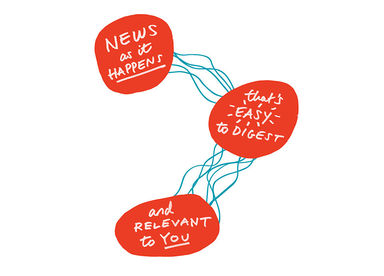
ITV News has become a major digital player thanks to their website’s efficient live update format, which Made by Many helped create back in 2011. They’re often first to break a story and have experienced massive growth in traffic thanks to a very simple formula:
We knew that an ITV News app would need to complement their website’s strengths and also take advantage of app-specific features, while offering a different experience to what’s already out there. Given that there are countless apps in this space, do people actually need another one? We would need to answer this question before going any further.
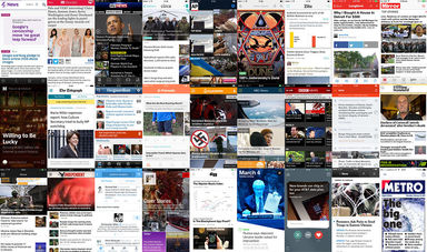
To begin, we looked at what other apps are doing both within news and in other spaces and the benefits that they provide. Then we ran a sketch session within the studio to brainstorm ideas, combining our research insights with people’s suggestions. We gathered the results and sorted them into categories relating to layout, interactions and features. From there we assessed what ideas could work for ITV News within the constraints of the project.
People who read the news on a regular basis tend to have routines that they stick to. If ITV News was to be a useful addition to their lives then it would have to adapt to suit existing habits. In order to accomplish this, we would need potential users to help us identify what layouts, interactions and features could work for them and which ones were dead ends.
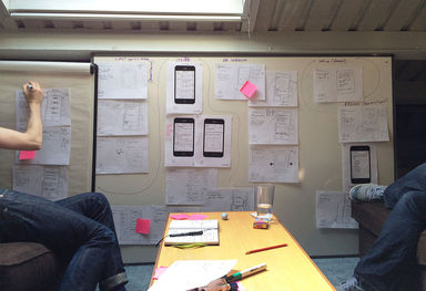
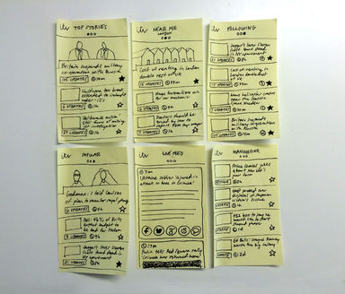
We took the most workable ideas and made some prototypes. At this stage there were so many possibilities, questions and unknowns that it was important not to invest too much time in making prototypes look beautiful, just making them good enough to get some answers. For testing segregated content pages, we put together some quite badly drawn screens of different sections on Post-its and put these in front of some people. They would tell us which content pages they were interested in (top stories, live updates, local news) and the ones they weren’t (a video feed was a no for several reasons including data usage, unwanted sound, and not fitting in with the way people generally get their news on mobile phones.) We quickly worked out our content priorities this way.
We also used Flinto to create some rough interactive wireframes for testing app features, navigation structures and design directions all at once. Using these prototypes allowed us to see what people did with the interface, not just what they said about it. It became quickly apparent which elements worked and which ones didn’t based on how successfully users made their way through the interface.
The benefit of making something fast and basic is that it looks like minimal time was invested in its creation and so people aren’t worried about hurting anyone’s feelings with their feedback. An honest approach elicits an honest response, and as a result we were able to learn a lot about what people want from a news app:
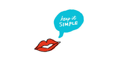
Keep it simple. You hear this all the time and it’s no different for news. People want to get the information they need as quickly as possible. They don’t want to spend a long time in a news app.
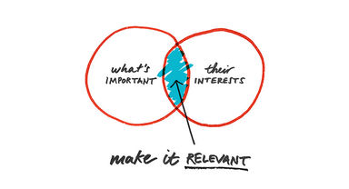
Make it relevant. People have different expectations and needs, but everyone wants to see stories that matter. This might mean top stories of the day, but can also refer to news from places that have personal importance.
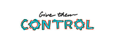
Give them control. People want to keep track of stories they care about. They want to share interesting things. They want to know why an app asks for permissions.
Crucially, people showed an appetite for a news app that does these three things well, suggesting that there might be space in the market for ITV News, and providing strong evidence that we should move forward.
Make, test, learn, repeat
We needed to make some refined decisions around navigation and features before we could start building. I used Keynote to create prototypes that tested variations of specific user journeys, which allowed us to compare and identify the most effective option for completing a desired action.
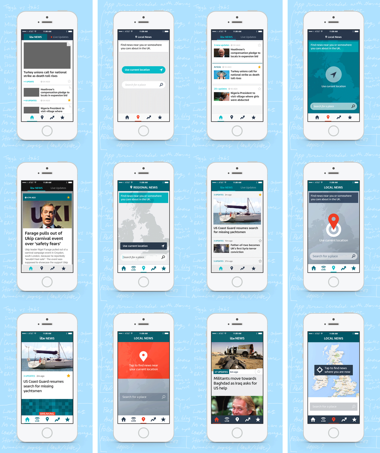
For example, we had previously tested both mixed and segregated content offerings, and found that separate sections were preferred for delivering news in different formats and contexts. We now wanted to know how to make these sections as easily accessible as possible, so we tested three approaches: swiping between sections, placing the sections within a navigation drawer, and tabs.
Despite being widely-used in app and mobile design, the drawer was the least effective way to navigate the app. Having the sections hidden behind an icon meant they weren’t as accessible and users didn’t feel inclined to seek them out. Less transparent navigation meant that engagement was reduced. On the other hand, swipes and tabs both tested well, with one key difference: when the navigation options were laid out as tabs, it gave users complete control over what sections they wanted to view. Rather than having to swipe through all sections to get to the last one, they could simply tap the relevant icon and go there immediately. Users could choose what they were interested in and ignore the rest. While this solution was the most visible option on your screen, from a usability point of view it was nearly invisible: when they needed to get somewhere, it got out of the way.
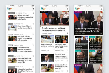
User preferences for design details — styling of elements, sizing of photos, typography, colour — were more opaque. Decisions here came down to a delicate balance between the requirements of an established brand, their content and the user. People have unpredictable and varied opinions, and ultimately the direction a design takes needs to be informed by the content it displays. When it comes to the way something looks the best frame of reference often isn’t user opinion, but rather how they interact with the content. Behaviour is revealing.
For push notifications, we created a contextual alert that allows you to receive important updates on the stories you follow. ITV News specialises in breaking stories quickly, and we wanted to work with this strength by allowing users to keep track of big stories as they develop. When a user turned on alerts, they would be asked if they’d like the app to send them push notifications. Saying ‘no’ would simply mean there was no notification request. If they changed their mind in the future, the app could ask them again, which saved them having to change the app’s notification preferences in their phone’s settings.
These steps made the app’s intentions known and helped the user feel at ease. Making the app transparent and simple to use were key demands from the people we spoke to, and essential for creating something that they would want to use as part of a daily routine. Over the course of research and testing we were able to get a strong understanding of what mattered most to users, and once our priorities became clear, we could begin building the product. Development was set up as four two-week sprints, each one beginning with a comprehensive planning session and ending with a retrospective. Having tangible goals and an informed list of features meant that we could finalise designs and build simultaneously, confident in the product’s direction and able to make necessary adjustments on the fly.
Points to highlight:
1. Tight spaces encourage clear thinking
With very little wiggle room, you’re more decisive about what matters and what doesn’t. You prioritise things that move you forward.
2. Listen to your audience
You’re designing for them, and they’re the difference between an app’s success and failure. Make sure you meet their needs.
3. Aim for excellence, not perfection
If you ensure that an app is useful, people will recognise its benefits. If you make it usable, they’ll be inclined to use it. Having ticked these two boxes, you have time to make the experience as beautiful as you like — you have a solid foundation on which to build.
Thanks to Jason Mills, Ashley Fletcher and Sheena Peirse from ITV for their brilliant efforts in making this app happen; Tara Bloom, Dan Brown, Andrew Walker, Heather Taylor-Portmann, Jamie Mayes, Tom Harding, Isaac Pinnock, James Higgs and William Owen for providing their skills and expertise throughout this process; and a special thank you to Raffi Jacobs for his tremendous effort in bringing the app to life.
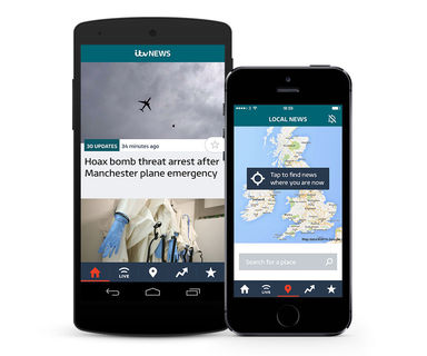
You can begin using the ITV News app right now on the App Store and Google Play.
Continue reading
Uber's Children vs Conscious Consumers
The phrase ‘Uber’s Children’ has been buzzing around my head since I heard Adam Morgan speak at the APG Big Thinking in Strategy Conference at the start o...
How and why we made two apps in nine weeks for ITV News
Back in April, when ITV News first suggested the idea of making a news app, we asked Why? We had doubts that an app was the best way to invest in News. B...
Designing for testing
At MxM NYC our team has redesigned, recoded, and restructured our client’s global e-commerce website twice within the past year. The first redesign gave t...


