How and why we made two apps in nine weeks for ITV News

Back in April, when ITV News first suggested the idea of making a news app, we asked Why? We had doubts that an app was the best way to invest in News. But after a quick round of investigating options and potential returns, and then 9 weeks of rapid design and development, we delivered two apps, not one. This is the story of why, how and what we launched into the App Store and Google Play...
Our initial scepticism about apps was grounded in the simple fact that ITV News possessed a hugely successful browser-based mobile product already, and the alternative would have been to explore lots of exciting possibilities for new kinds of story production and presentation that could help build traffic on mobile, tablet and desktop.
With 66% of traffic on mobile and 70% acquired through social referral ITV News had become one of the most mobile, shareable news services in the UK - more mobile than Buzzfeed and just as social.
In 2012 we had launched ITV News for desktop and mobile as a stream of breaking live updates, which was then (and in many ways still is) a new and radically different approach. The site grew phenomenally fast, from 0.6m unique users before launch to 13.3m in July this year. But in that time there had been just a few relatively minor release updates; if we wanted to keep building the audience there was a strong argument for re-investing in web instead of an app.
And the speed of the bespoke editing tool we created for the news team meant that ITV News consistently broke stories first and achieved high early rankings in Google News. These were the prime drivers of growth, but the importance of social referrals did create a risky dependency on Facebook newsfeed algorithms.

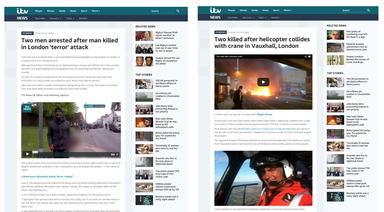
Woolwich terror attack and the London helicopter crash - two of many news stories to be broken first by ITV News online
Why? A clear user need and promise of stronger engagement
A quick round of discovery and analysis showed that there were two powerful arguments for investing in apps. The first was the prospect of much higher loyalty and engagement: we received reliable reports that competitor apps were attracting page views and duration per visit up to ten times higher than in web browsers. The second was firm indications of strong demand: surveys and early quant studies confirmed that the ITV News audience wanted the convenience of news one touch away from a mobile home screen. This should be money well spent.
And when it came to working out how we should build the apps it soon became apparent that we could get a much higher return by taking the hybrid route.
The answer to How? was hybrid
The How? was closely related to the Why? The expense of native apps was one good reason for querying whether to build an app at all. Native apps offer smoother and more precise interactions but they are more expensive to build, difficult to test early or change and - where multiple operating systems are involved - imply a costly upgrade and management overhead. If, instead, we could create a good enough app using HTML5 in a native wrapper - with push notifications - then the economics worked too.
The decision to go with HTML5 was vindicated when we delivered iOS and Android apps together in just 9 weeks.
And then there was What?
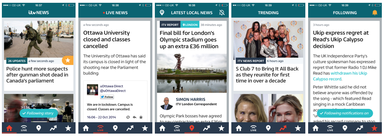
What should we focus on? The ITV/Made by Many product team wanted to keep things simple: play to strengths and also create a delighter. ITV News’ competitive strengths online are in breaking international, national and regional news, backed by a strong video-centric broadcast editorial team following the big stories. This gave us three obvious priorities: breaking news; following the big stories; and - as a delighter - mixing in regional news by exploiting the phone’s ability to geolocate itself.
We could also gain an advantage by eliminating the fuss of nested topic navigation. ITV News doesn’t have to pretend to be a comprehensive all-in package like a newspaper. It sets out to follow the big stories well. And so there’s no topic navigation at all in the ITV news app. The navigation is deliberately simple and reflects precisely the user goals we want to serve; the app navigation is an exact mirror of the design strategy, serving:
- What are the big stories that matter?
- What’s live and breaking now?
- What’s happening near me?
- What’s trending?
- What’s new in stories I’m following?

Five simple navigation options, always visible: top stories, live news, local news, trending, stories I'm following
There’s much more detail on the design story in Owen Thomas’ post, here.
After a soft launch in the app store in August and some very good reviews (with particular praise reserved for the regional news features) we’ve made some improvements based on use and the product is shortly to be marketed on-air from National and Regional news bulletins. We’ve also used this round of product development to make some important improvements to the website, which is now responsive and rebranded with a home page optimised for growth - and for national and regional editorial practice.
Continue reading
Creating a more focused news app
We recently helped ITV News launch apps for iOS and Android, a project that involved some pretty creative methods for getting maximum results in a short s...
Designing for testing
At MxM NYC our team has redesigned, recoded, and restructured our client’s global e-commerce website twice within the past year. The first redesign gave t...
Mining insanity
In 2008, I hacked together a little experiment called I Feel London, enabling people to share places they like to visit based on mood. It was, as you can ...


