We’re building the next stage of Picle ...
A little blog covering some Service Design elements within the evolution of Picle. I've been creating the user journeys and mapping flows to determine the layout and structure of Picle 2.0 ... here's a little taster of my process.
Believe it or not, Picle has been around for 6 months now. As more and more people around the world have started using the app we’ve been collecting feedback and ideas about how to grow, expand and extend Picle. We see it as a collaborative project with our many users.
In this time we’ve seen some brilliant Picles - people documenting moments and events we’d never dreamed of. Some beautiful, some insightful, some just plain amusing. It’s this adventurous spirit that has spurred on the creation of Picle 2.0
We’ve seen and heard from Piclers that they would love to see more connections between users. You’re an inventive bunch; and we’d love to encourage this by inviting you to share your Picles with a wider group and, in return follow Picles being produced.
Picle 2.0 is going to involve more sharing, following, commenting & showcasing of awesome content. But you knew that already - this is the world we live in.
What we want to achieve with the new version of Picle is increased creativity, allowing our wonderful Picle users to make and share their awesome experiences, and keep up to date with what their friends are up to. Kodak moments for the digital era.
So, how are we making it happen? Between taking ideas from conceptual loveliness to lines of code, Service Design steps in. We’re planning for Picle to go from a simple ‘capture and publish’ app to a ‘view-discover-inspire-capture-share-group-invite-add-collate and publish’ app. There’s an opportunity here to craft something great, but first we need to untangle the mash of ideas, consider how real people are going to use the app and then think about building the various avenues of it up.
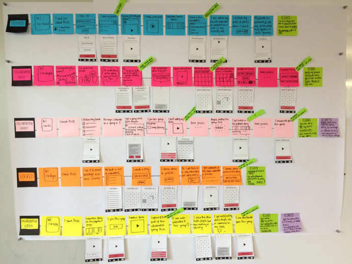
I created a series of diffierent user journeys, one for each of the 5 variations of paths that an individual may be able to take through Picle v2. Each journey (the lines of post-its) shows the types of actions that that person can choose:
- is simply sharing with friends following them.
- is hosting a story, and inviting friends to add to it.
- has been invited by a friend to add to a story.
- is publishing to a wide following (a band, an event, a brand.)
- shows the option to add your picle to wider group story (documenting a large event, a city or a trend.)
Through each of these journeys, I highlighted each of the touchpoints/screens that you will need in the app. This is rough working, but it's the start of shaping everything that needs to be contained within Picle v2 if it is to be able to enable all of these wonderful sharing capabilities.
User journeys are also a great way to explore the actions and decisions that people may encounter when using it for real. As we’re adding additional features to an existing app, we’re also playing with adding new behaviors. This will, of course, require testing, but user journeys are a great way to break a big piece of design down into relevant, workable sections.

Each of these new behaviours sit nicely in seperate user journeys, but people using Picle don't sit in neat, colourful post-it lines. People play with apps, they explore, press buttons experimentally and jump around the flows you lay out for them. We're planning on adding quite a lot of new functionality to the new Picle, which means that we have to think about where this will all live within the app. As a user, part of using an app seamlessly is knowing how to navigate your way around it.
I’ve been working on the navigation options and user journeys simultaneously in order to make sure that we find the perfect match between them.
I started by simply writing each of the functions, new an existing, on a post-it. I then grouped those that made sense to be together (all functions to do with inviting friends to a group story, editing and deleting stories, viewing subscriptions) and created a series of options of where each of these groupings of functions could sit within a navigation.
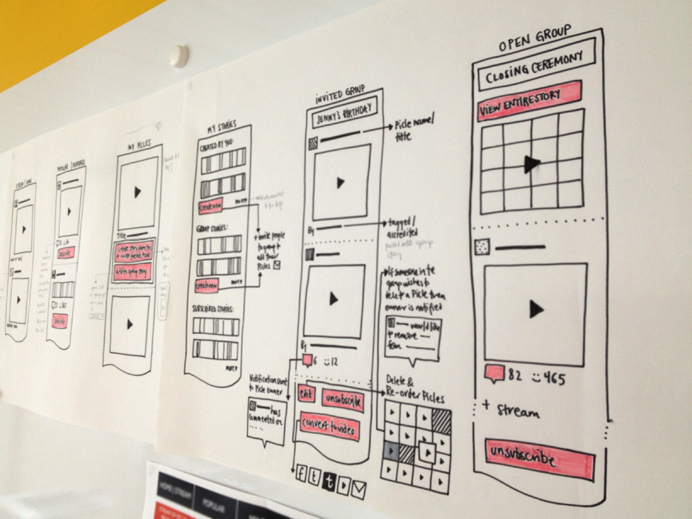
I then took these workings and drew them out as wireframes. This means I can start to lay out ideas for language on buttons, what links need to be displayed where and get an idea of just how much needs to sit in each of the 'pages'.
These flows then need to be walked through, bringing each stage to life in sketches and wireframes before they can begin to be built.
We’re now going to put our ideas to the test, and run some prototypes of Picle v 2.
We’ll keep you updated with how this in going on Twitter [@picleapp]
Likewise, we’d love to hear your thoughts and ideas for the evolution of Picle - a wee email to kirsty[@]madebymany[dot]co[dot]uk or a tweet to @picleapp is always welcome.