A deeper layer of digital

The previous instalment of this story discussed the work Made by Many did on the Victoria & Albert Museum’s web presence, in particular on technology and strategy. In this post, people who worked on the project consider issues around collaboration, design and the museum’s digital future.
COLLABORATION: Opening the museum up through digital
William Owen, Founding Partner, Made by Many: it was a very collaborative process, and collaboration clarified the design strategy. Joint workshops enabled us to discover significant properties of temporary exhibitions that demanded a modular content approach that enabled exhibition pages to adapt to the changing communications at different phases: before, opening week, during, last week and closure. We focused on the V&A’s extraordinary galleries as a means of explaining a complex museum with no simple sell like the Mona Lisa or Nightwatchman. We defined the object (museum artefact) as the lowest level content entity, rather than the page, so that objects could easily be connected with related objects or narratives and become a valuable digital resource. The results were visible in demos in the V&A auditorium every fortnight with 50 to 70 people. Breakthroughs came on the first and second demos, which were delivered on time, and the staff could see things happening. There were people from membership, learning and some of the curators and some of the senior marketing team. The head of collections and deputy director to came to every demo.
Susan Lin, strategist, Made by Many: the invitation to attend these regular show-and-tells was open to everybody at the museum. These were opportunities for the digital media team to share with the rest of the museum about what they were involved in and what they were doing.
Workshops involving people from various parts of the museum also created great opportunities to debate, and people from across the V&A got to have their say: curators, conservators, researchers. Some of the sessions lasted for hours, with the opportunity to debate and safe space in which to do it. As a result, we created something that accurately represented the different departments to their audiences.
It also represented what the users were telling us – we did lots of testing sessions with real users including some guerrilla testing at the museum itself. We’d ask people wandering around for a 15-minute chat about prototypes and examples of the possible future website. Doing things like that that really elevated the role that digital can have in a leading institution.
Enabling collaborative content creation
Susan Lin, Made by Many: we also wanted to build a website that allowed the digital media team to actually be the creators and the curators of content, but also allow more of the collections staff to be involved in the production process: so, a curator could write something too. How do we enable everyone else in the museum to freely write content themselves? The key focus was on giving the organisation the tools to do that.
Tara Bloom, product manager, Made by Many: the digital media team are now much more empowered to work with the rest of the organisation and people go to them for input into decisions. Previously, the digital media team were seen as people who just put content on the website rather than being responsible for a product.
DESIGN: beyond a digital brand refresh
Kati Price, Head of Digital Media, V&A: one of the pillars of the V&A’s strategic plan for 2015–2020 is to showcase the best of digital design. For us it’s absolutely vital in a way that’s possibly more important than for other museums. So our digital design has to be outstanding in terms of user experiences and brand, and really do justice to the V&A which is a strong global brand. As the world’s leading museum of art and design, we need to be right up there in terms of our design credentials, and Made by Many helped us do that. It was absolutely vital.
Also, we’ve got this incredible logo by Alan Fletcher of Pentagram. It’s one of our key assets. What was amazing about the work that Made by Many did was really understanding how the logo worked as part of the brand and how we could expand on that online and really use elements of it.
Mike Walker, design lead, Made by Many: the design challenge we faced was to engage people on the V&A website and then inspire them to make a visit to the museum. Beforehand, the museum website was pale and could have been a corporate website, and it was challenging for people to find their way around it. Our task was not only a visual one, it was also about improving navigation and balancing visual enhancements with accessibility. A lot was done with visual cues, making the site richer with large images and video, bringing the interior of the museum to life online, especially through the objects and galleries which we helped make the core focus of the museum’s new online experience.
Aesthetically, we strived to achieve a balance between cutting edge and classic – just as the museum is, where artefacts by Alexander McQueen sit side by side with incredible collections of artists such as Constable or Raphael.
Logo, font and imagery
Mike Walker, Made by Many: the V&A branding is modern, bold and distinctive but also retains classic elements, such as the letterforms used in the logo symbol, designed by Alan Fletcher in 1989. Wolff Olins contributed an enhanced identity which encourages novel representations of the logo when paired with images in print.
We didn’t want to use the logo in a standard way online either. Websites often put their logo top-left or fixed on the page somewhere – a stamp saying, “This is by us.” In print material the V&A logo is always partially obscured by artefacts and images, which is hard to replicate digitally, but it inspired me to find new ways of combining the logo with artefacts on the website.
Big images, whether of ancient or modern art and design, are integrated with the logo which is also used large; this did a great service to the brand, allowing the objects and galleries to speak for themselves in a way that was intrinsically linked with the brand identity.
Colour & Accessibility
Mike Walker, Made by Many: with colour, the brand guidelines say only that pure black should never be used, and although the website is very dark in places, it’s never black, always just a very dark grey, whereas the old site was pure white. The darkness adds drama to exhibitions and helps to frame the content in a modern way. We also added a little highlight colour. This “theme colour” is really important: it needed to vary across pages to combine and complement the colours of these big background images on each page. We wanted a good range of colours that match the images that editors might use, and stand out enough that someone with poor vision can see it.
Accessibility is important but often gets forgotten. Both young children and pensioners would be using the website so we were in a battle between making things readable, and having the visual style and branding that we wanted. These big images with text over the top are difficult to pull off, because we wanted to make sure that it’s readable enough for everybody. That was a challenge.
Kati Price, V&A: we’ve been very strategic about what parts of the overall experience we tackle first, and we now have a new website and the most heavily visited areas are completely overhauled, which means that the user experience is brilliant. With the brand experience, we now have an articulation that we didn’t have before and which can travel across different platforms and incarnations.
We’ve also been much more bold, upfront and playful with the brand, in a way that we’ve done with print that we haven’t really done until now online. We’ve got the user benefits of an easy to use, functional and beautiful website, but also something that works much harder for the brand as well.
Rethinking the V&A’s Collections
Tara Bloom, Made by Many: one big question we explored was how we represent collections online. We wanted to avoid the issues that the previous site encountered where there were hundreds of “hub pages” to cover every possible cross section of the museum, with one for Christmas, for instance. We didn’t want to stick too closely to how the physical museum structured its collections as it doesn’t always make sense to mimic the ordering of physical space online.
This all meant we really had to be clear what we wanted before we started building. It was in part a painful process. Each conversation tended to end up with us trying to tackle the entire taxonomy of the museum as we wanted to join up the physical and digital experience if we could. The solution was a pragmatic approach that focused on collections first, galleries second; this made the most sense for the web.
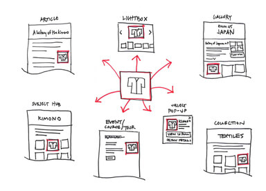
Mike Walker, Made by Many: as part of the “strategic slice” of the new V&A website, we chose to design the structure, content and layout for collections pages. We knew the collection pages had to be a destination in themselves, full of rich content, imagery, videos and objects. Collections often felt like they were optimised for researchers or enthusiasts more than for general visitors – often logically, as if walking between collections. But online visitors don’t have a space to walk through, and instead have a site to navigate. We saw an opportunity to expand collections into collections, galleries and themes.
We also observed how collections were often confusing mixes of materials, techniques, eras and gallery titles. A further idea was the concept of themes. “Collections” as a word evokes the image of objects and artefacts in a physical space, whereas theme is a broader term, linking objects: being made in silver, being an item of jewellery, or being designed in Art Nouveau style, for instance. Why? Because online visitors may be looking to see all objects in the museum designed in the art deco style, rather than split into rooms or collections such as jewellery and furniture. Art Deco isn’t a recognised V&A collection per se, yet the museum has the largest body of Art Deco objects in the world. So, in the end we used the word ‘collections’ in its broadest sense to display the museum’s collections pages and digitally link objects across collections, rooms and galleries.
Collections are also a branding opportunity to highlight the best of the V&A’s objects that are on permanent display. We worked with the V&A’s content team to choose the most important ideas, placing these on the main navigation page for Collections. This list can be changed at any time, allowing the museum editors to show whatever collections are most important at any point.
THE FUTURE MUSEUM: transforming an organisation through digital
Kati Price, V&A: a digital project can often be a Trojan horse for much bigger cultural change. I was always aware that there was going to be a need for much bigger cultural change that sat behind and supported rebuilding the website. That was around how digital media is perceived by the organisation – people really understanding what digital media as could do for them. Most of our visits are virtual and people encounter us online. It’s really important to make sure that experience does us justice.
For people to really understand that and not just think, “This is a nice little refresh” requires quite a lot of work with our internal stakeholders. It’s a bricks and mortar world, so how do we help take those transitions from a virtual world into the building?
William Owen, Made by Many: we’ve learned it’s possible for a cultural institution to create, manage, and grow its own digital channels. That is an enormous thing. Our approach was to attach a slice right through the visitor experience and deliver this quickly, and then to address secondary or more technically challenging but less valuable parts of the site. So, rather than spend a year configuring a product like Adobe Experience Manager before launching, we got a very substantial part of the new website out to the public in three months. The V&A team is currently attacking the shop and calendar sections and expects to launch all of these in the new brand this autumn.
Mike Walker, Made by Many: we’ve pushed the brand a lot further online than the V&A thought possible. The V&A Design Director, David Bickle, was impressed that we had managed to augment the print material which the V&A had been doing for a long time. He said that the V&A brand needs shaking up even further, and digital is a great place to drive that change.
The V&A invited us in to look at how digital can really change the shape of the organization and although the original mission wasn’t to change the future direction of their print and museum branding, that could be one of the consequences the website has in the future.
Alex Stitt, Director of Commercial & Digital Development, V&A: today, the front end website is better designed and we’ve been through a process of rethinking how it displays the information we want it to display. We’ve invested in something that looks good, but now we have a motivated team of people who can get stuff done. Confidence in the digital media team has skyrocketed now that they can do the things that they are asked to. They can play their part in life at the museum. The kit doesn’t crash, it doesn’t have any bugs, we don’t get complaints about it. It’s working well.
William Owen: we can also push further forward from a great foundation. We’ve created a better understanding of the museum and how to enjoy it, hugely more effective and efficient production tools freeing up the content team to be more creative. Now they have the ability to grow. It is a great resource – the data architecture of the new vam.ac.uk creates extraordinary possibilities to open up the museum collection for both research and general audience participation.
Kati Price, V&A: this new website and expression of the V&A brand online is helping us show how understanding the future by looking at the history of design is really important to us as an institution. This new website really allows us to forge connections – it can bring 5,000 years of human creativity to life online and show the breadth and the depth of it. That’s something we could not have possibly done in the past.
Continue reading

Technology
Notes on React Native QA
Here at Made by Many we’ve recently developed two apps using the React Native framework, which gave me my first chance to QA apps built in it. This is how...

Business Strategy
A deep layer of digital
Earlier this year Made by Many completed a project to refresh, enhance and supercharge the Victoria & Albert's web presence – applying a layer of digi...

Business Strategy
What aniseed balls taught me about innovation
On the surface, innovation labs and World War Two Britain don’t have that much in common, but actually there are some remarkable similarities – of what ca...