Getting to grips with product design
As a digital designer, growing up in London, I have always been inspired by the power of design, and the influence it can have in changing behaviours.
Since graduating from the Arts University Bournemouth, I have been trying to reflect and work out what sort of designer I want to be, as the design industry is such a massive field. I knew I wasn’t going to be satisfied with just being a pixel-perfect designer and felt that an internship at Made by Many would give me a deep dive into the world of UX and product design.
I didn't really know what to expect when I started the program, comparing it to university, our projects were very conceptual and about big thinking, so it was great to get agency experience working on a real live brief. Eight weeks later, I have been working in a team of three with a Product Manager and Technologist to rebuild a digital platform called Test and Build created by the Behavioural Insights Team. And it’s been a blast from ideas created, to runs along the canal to company karaoke.
Filling the blank canvas
At Made by Many a lot of focus at the start of the project was on user research. This was quite different from the way we worked at university -- whilst research was part of the process, it was usually more secondary research online or reading books.
We started with stakeholder interviews which were key in helping us find out the client's current and future expectations of the product. These then led us to create a series of journey maps, to see what was currently working and what wasn't, helping us to identify any pain points that we could address. We were also able to speak to existing users, this was very interesting to see how they interacted with the platform and brought up a lot more challenges and ideas for us to solve.

Keep it simple
Test+Build is an online platform that provides people in the tax and charitable sector with the tools and materials they need to run their own randomised controlled trials. It works by helping improve the impact of their communications and measure their outcomes, whether it be a letter, text or email. Our main project goals were to redesign the platform by making it more user-friendly, looking at copy, design and flow of the overall process (which is a mix of consultancy and online interactions)
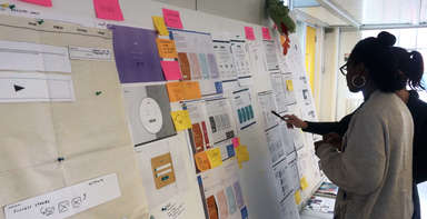
Many research sessions and post-its later, we were inundated with ideas and opportunities that we synthesised into manageable chunks. From then we turned our ideas into sketches; this was my favourite part of the process as we were able to get our ideas out using simply just paper, post-its and sharpies. Working in this way meant we could work quickly as there was no worry about getting it right or being perfect -- the important part was communicating the idea.
Another part of the process was creating design principles. These acted as a strong framework and guidelines that could be used between us and the client to ensure that all of our design decisions were aligned. To generate these, we took inspiration from what users had said and ran a collaborative workshop with the client. We got them to individually consider what each principle meant to them and asked them to vote for the one that they aligned with the most. This led us to a prioritized list that everyone on the combined team agreed with which was then referred back to a lot throughout the project.
Make, Test, Learn, Repeat
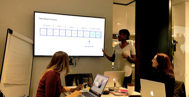
We then turned our sketches into prototypes working in Keynote and Sketch to mock up our ideas. Again this was quite a fast process working in black and white and very limited styling, to not sway the users, whilst our focus was still on establishing the best flow and interactions.
We then had two rounds of user interviews face to face and remote with prospective users and members of the public to get their impressions of the platform. This was very rewarding and a different way of working; usually at this stage, I would focus on the UI detail and getting it pixel perfect, so it was great to work in a manner which was ideas-led as it opened up greater possibilities.
In the course of designing an online form for the platform, we had to work with lots of text which brought up lots of opportunities to explore standard web design practices. It gave us a fresh perspective on our ideas and designs, for example: exploring the effects that something as apparently simple as the placement of a button or ‘save’ versus ‘submit’ can have. One challenge we were trying to address was the concept of progress. To work out the best way to let users know where they are on the platform, one of the users suggested having a personalised progress bar which would identify both their tasks and the client's actions, a concept that we explored and incorporated into later iterations of the design.
To summarize my time at Made by Many, it has made me realise that as designers we shouldn’t be focused on pixel perfection. Instead, we should focus on generating as many different concepts without barriers or limitations. This is also best done in a collaborative group environment as you can build on each other’s ideas. More importantly, as a designer, focus should be on who you're designing for first, and then what we’re building second -- the user should be considered in every design decision made.
To see more of my work visit: www.nadinegrantdesigns.com