What we mean when we talk about ‘Product Feels’

‘Product Feels’ grab people by the heart and make them feel something every time they use a product.
Here’s how a feelings first approach to design moves users and keeps them coming back for more.
The idea
Consider why a particular person should use the product you are designing. Now think about how this person should feel at distinct moments when they use it. These feelings are likely to be something designers can empathise with. In fact, they’re an effective decision-making tool for designing great digital products.
I consider user feelings every time I make a design decision. If I draw my decision-making process it looks something like this. (Completely inspired by Simon Sinek’s ‘Golden Circle’).
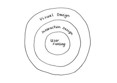
I like to put user feelings at the centre of my thinking. Emotions are why people become attached to the products they use.
For Jon Kolko, emotions are the ‘soul’ of a product. He argues that lasting value and engagement forms for a user when a product makes them feel a particular way. He believes emotional requirements are more crucial to core decision-making than functional ones. This is because emotions ‘exist across every use case, in every facet of the product, and dictate, describe, and artificially contain every other product, quality, usability, marketing and design decision that follows. Simply they trump everything.’ You can read more in his book, ‘Well Designed’.
In other words... put the feels at the heart of your design process to make products that resonate with your users.

So... what about those circles?
A user’s experience of a digital product starts in the outer circle and moves towards the centre.
First the user builds a visual impression of what the product does. They see shapes, colours, typography and imagery. The user knows which elements are links and which are buttons. Good visual design emphasises content by making it legible, consistent and usable.
Second, the user interacts with the product. Tried and tested design patterns help the user to navigate, find content and perform tasks. Good interaction design makes it clear how the user can achieve their goals with the product.
Finally, interaction and visual design blend to evoke emotional reaction from the user. Has the user been successful in achieving their goals? Was the journey easy or difficult? Did it burst with colour, or was it pared back? How did it make them feel?
The best products and services are designed from the centre circle out. This means starting with how each user should feel using your product and design out from there.
Here are two examples of how I’ve applied this thinking on different projects.
Limitless possibilities
I applied this process when designing a new user experience for Hackaball — a connected toy that helps kids learn basic programming logic through play. It’s a computer you can throw.
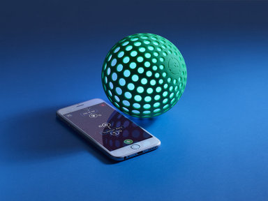
Hackaball connects to an app for iPhone or iPad, which helps children to make games and upload them to the ball. Children choose from a limited set of inputs and outputs, and combine them to build a game.
The limited number of rules is key to making the interface easy to understand. But we ensured it's still possible to make thousands of different game combinations.
I wanted to exaggerate the opportunity to make thousands of different games. In fact, I wanted children to feel like they could make any game in their imagination. I wanted the experience to feel limitless.
I put this feeling at the centre of my decision-making and began working outwards.
When designing a menu for the user to save and find their games, I took inspiration from this feeling. I chose not to design a completely functional menu with a list of game names and descriptions. I learned this would be difficult for children to read, and it was quite boring to navigate too.
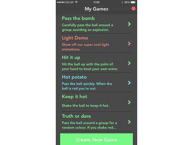
The prototype app featured a list made entirely out of words.
Instead I chose to design a menu which celebrated a diversity of rule combinations. I wanted to make each new game look unique by visualising its rule structure at the menu level. In doing so, I hoped to encourage children to be more innovative and try more combinations.

When visualising the structure of each game, I had the idea to represent each game as a constellation. This analogy was perfect for making Hackaball feel limitless, like an ever-expanding universe.
Iterating on visual design, the constellations took on new forms. Inputs such as 'When I am Shaken' connect to other inputs like stars. The outputs of each input, such as sounds and vibrations, look like orbiting planets. Colour gradients communicate the change in lighting between each action. An anti-gravity effect makes the constellations bob up and down like Tim Peake on a spacewalk.

Suddenly our basic games list transformed into an ever-expanding universe of games. A design that captures the essence of our core user feeling of limitlessness.
Making people with Diabetes feel like people, not patients
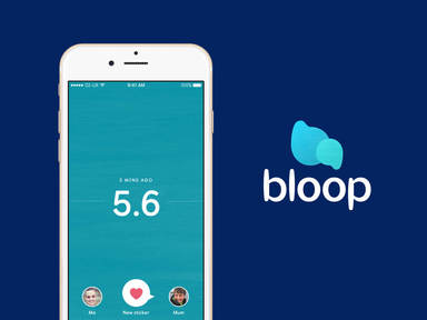
I applied this process to another side-project called Bloop — an app for maintaining healthy control of diabetes.
People with diabetes prefer not to think of their condition as something medical at all. By talking to people with diabetes, I learned the service should focus on promoting a healthy life, not managing a chronic condition.
This insight helped to ensure that Bloop feels like a service for people, not patients.
Bloop shares a person’s blood glucose with their loved ones whenever they take a reading. This means they can focus on living life, instead of communicating their condition.
The communication of this medical data is key to how a person feels about the service. I didn’t want it to feel sterile like a hospital (like most other apps for diabetes), I wanted it to feel human.
In the medical world, blood glucose is a numerical value. But in the human terms you are low, high or in-range. It's dangerous to be low or high, so in-range is the desired reading.
Using the height of an iPhone screen, the numbers float up or down depending on whether the result is low or high. Because screens are not very tall, a colour gradient exaggerates the change in height.

In the middle the scale is a calming teal colour, like the surface of the sea. As the user records high or low readings, the gradient shifts to give the impression of height or depth. The changing scale motivates users to react by eating food or taking insulin. It's like swimming up to the surface, or parachuting down from the sky. The gradient encourages users to move back towards the healthy middle — in a human way.
Further to colour I experimented with texture. I wanted to add a feeling of humanness that is absent from healthcare services in the app store. Subtle brushstrokes give a feeling of hand-painted walls that add to the calm of the blues and teals in the app.
Unfortunately, the numbers are too important to remove altogether. So I searched for a typeface that could add warmth to the cold data of diabetes. I chose a font based on how children learn to handwrite, called Castledown. It has a human and approachable character. This masks the medical nature of the numbers, without patronising older users.
Bloop places a feeling of humanness at its heart, which ensures users feel like people, not patients. This is crucial to getting people to use the service often and make it a daily habit — aiming to improve their health long term.
Make this process repeatable
Of course, no two projects are the same. It helps to take a structured approach to designing for people's emotions.
1. Know the people you are designing for
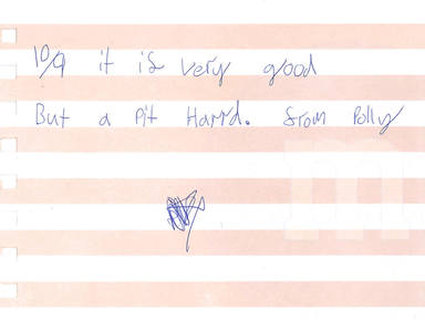
Polly (aged 9) gave our Hackaball app prototype 10 out of 9.
The needs of the users, the business you’re working for, or the stakeholders of a service, will change with each project. You can only apply this process to each new project by getting to know the people you are designing for. Get to know them well.
To understand that children need to feel like Hackaball is limitless we had to talk to loads of kids and their parents. To understand that people with Diabetes desire a more human service, we had to talk to people affected by the condition. Only through good user research can you build this kind of empathy for your users.
2. Extract feelings from your research
Once you do empathise with them, it’s easy to write down lists of their needs, hopes, and ambitions. You know what makes them tick, so you also know how they want to feel. Write a list of user feelings to start, then you are ready to play with them using the ‘Golden Circle’ method above.
3. Choose a feeling and stick with it for a while
You don't have to draw a circle round it. It’s okay to follow this process in your head. But it may be useful to write down a word or short phrase that captures the emotion you are designing for. Stick with it and see how it changes your design ideas.
4. Move outward through the circles
Go for it. Keep referring to your chosen emotion while you solve each design problem.
5. Don't be afraid to change the labels
I've written this post about how this process can help with interaction and visual design. There's potential to extend this approach beyond the screen too.
As designers we often consider problems that are more experiential in nature. Timeliness of notifications, compelling copy, a human touchpoint in a service... perhaps you label the second ring, ‘Content Structure’, and the outer ring, ‘Copywriting’. This would be an effective way to design a product's tone of voice and content strategy using emotion.
Try different labels, but concentrate on starting with a user feeling first. Move outwards and keep refining the design based on your chosen emotion.
***
Working in this way, you are giving yourself a miniature value proposition to follow. You are being proactive about how to unlock emotional value for the user and getting them to come back for more.
If you've got any thoughts on this approach, please get in touch. I’d love to know how it makes you feel. 👻
Continue reading

Technology
What if AI is a failed dream?


Technology