When a sketch isn’t a sketch

The evolution of the humble sketch
Like the products we make, our tools and processes are constantly being iterated at Made by Many. One of those is the continuing evolution of ‘the sketch’.
The value of sketches is they simply and effectively get to the heart of a proposition or service idea. We use them often as a first step in talking to real users in the early stages of a project vision. We tend to take several sketches into early user research, created at speed using just enough design. An effective sketch provokes a reaction, discovering whether someone values an idea or not. They are loose enough for interpretation that invites critique over getting bogged down in detailed design.

The classic

Where it all started. In the past we’ve found the hand-rendered feel gives users the perception that there’s not been a great deal of investment put into the concepts, therefore they feel more comfortable giving honest feedback. But when drawing sketches, mistakes can happen and inevitably they end up being scanned in and errors photoshopped out. Real text in our sketches is incredibly important and any spelling errors or copy changes can be time consuming to amend. When moving fast and doing just enough design at the right time, hand-drawn sketches can sometimes feel like stepping down a gear.
The halfway house

To add more believability, we sometimes go into a blurry semi-realistic hand-rendered sketch-like place. Integrating photography and imagery brings content to life and stops you from having to draw cheese and mountains by hand. But it’s an extra step in the process that needs to be factored in: Sketching, scanning in, collecting content and photoshopping elements in.
Sketchy Keynote

Sometimes we use sketchy templates in Keynote that mimic hand-drawn sketches which can be pulled together in a much shorter amount of time. Coupled with a hand-rendered font they get the job done. The upside of Keynote is the potential for collaboration across a team (not just the designer’s domain) and can be iterated incredibly quickly. We’ve used them for testing a proposition in multiple languages and having the ‘sketches’ digitally meant this was super easy.
Loosely un-designed

Finally — we also throw skeumorphism out the window and create ‘un -designed’ sketches. Okay — this might be a stretch to call these sketches, but they can be treated with the same throwaway mindset as a hand-drawn sketch. I feel users are more willing to impart critique at this level of fidelity more and more as there’s a much smaller mental leap to what the real thing could be like. Created in whatever design tool is quickest (Keynote ftw), these visualisations start to look more like the real thing more quickly. You should use real content and real copy — the trap to be aware of is getting sucked into design details that don’t matter right now.

What’s in a sketch?
In the same way that pen and paper can bring freedom to generating ideas, does jumping straight to software make us over think our ideas at such an early user research stage? Is it worth cracking out the Sharpies to hand-render an idea at this moment in a project? In the eyes of our users, are computer-rendered sketches too close to reality, and not loose enough to interpret?
This has been an evolving journey over my 6 years at Made by Many. I must admit that the majority of my ‘sketch’ work sits more towards the end of this evolutionary timeline. But regardless of what fidelity we choose to sketch in, I run through this checklist when figuring out which method to use:
- Be clear about your learning objectives
- Focus on what you need to find out right now, that gives you the confidence to make progress
- Select the level of fakery that best invites critique
- Use just enough design to make it feel real
I’d love to hear how you sketch or render early ideas as part of user research.
Check out Tom’s keynote sketching template to create your own.
Continue reading

Business Strategy
Made by Many’s history of 2016 in 26 objects*
An end-of-year listicle in the form of an A-to-Z which, coincidentally, has 26 letters. Hence, 26 things done, said or made by Made by Many this most weir...
Design
Principles for encouraging customers to buy more than an exhibition ticket
Lessons learned from designing for cross-sells with the Royal Academy of Arts
Process
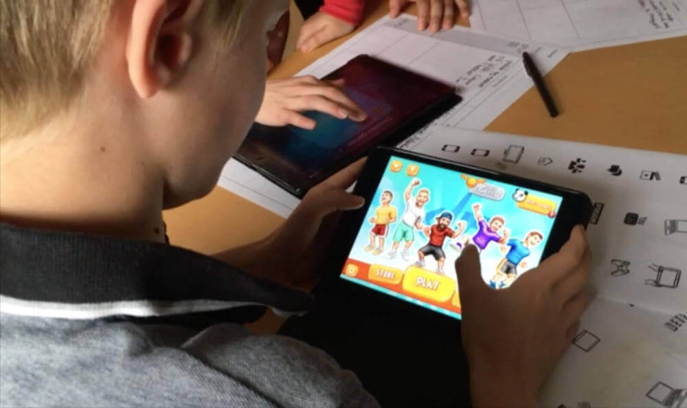
3 ways to get the most out of kid-centered research
“You two look like Ant and Dec.” A small finger prods at me through the air. “You… are Ant.”Knocked off balance I look to my colleague for reassurance, on...