Avoiding the monster truck problem

Some Working principles in designing for an older audience
The needs of the older generation are often overlooked in a fast-evolving industry such as tech. Products and services are near enough always built for young tech-savvy adults, all of which is reflected in marketing campaigns with hordes of ridiculously good-looking people gawking over a video message. However, we know that the older generation isn’t as tech-illiterate as some people might think. iPad sales are booming at the moment, and my guess is that many of those sales are being driven by older people. The device is much bigger than a standard phone, making things clearer and easily legible.
All this has been on my mind because I recently designed a Classical music streaming service called Composed (www.composed.com) for Universal Music Group, and our target audience was 40-to-75 year olds. Thinking about this audience was new to me — as part of our field research, we went to visit some people in their homes, looked at how they consume music and saw how they live with music around them. Here are a few things that really stood out on the project for me — they’re useful starting principles to work by when designing for an older audience.
Design begins with Empathy

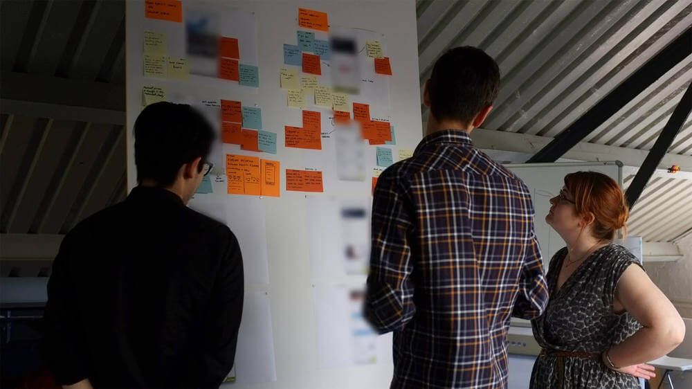
At Made by Many, we — and probably you too — have the luxury of working on the latest MacBooks and Cinema Displays, but the people we design for often (almost 98 per cent of them) don’t have this setup. So, never make assumptions, and try putting yourself into user’s shoes. We kicked off the research by visiting people’s homes, to understand how they consumed music on a daily basis. It was a big insight into their world, something you don’t get by conducting an interview in an office. Some users categorised their music in alphabetical order, others chronologically or by composer, while some didn’t care — music for them was something which just played in the background.
We got them to do a service ecology exercise, where they mapped their music habits over the course of a day, week, month or year. The results could be anything from listening to Classic FM on the radio, to watching music at their local concert hall. From this map we started to gauge an idea of which channels they used for listening to classical music, and also the frequency.
Simplicity: start with what’s already out there.

Next we got users to perform simple tasks such as searching for Bach on iTunes and Spotify, two of the biggest existing music services. This isn’t specific to designing for the older generation but it gave us an early indication about how easy these services were to navigate around. We could observe how legible they were, giving us an insight into font sizes, typography and so on. A big insight when watching people use Spotify or iTunes was “choice paralysis” — there is simply too much choice in the interfaces, which leads to confusion: on any one screen there are over 60 clickable areas (I counted 125 on the Spotify screen above). Where do I go next? Using this insight as we moved into the design phase, we decided to keep the structure of the service really simple and surface only a few things on screen at the same time.
Engagement: try co-designing with older audiences

Another thing I realised was that when it comes to the design process, the older generation are much more open and engaged than the younger generation. In fact, once they feel comfortable, it’s hard to stop them. Older audiences are far from shy — they can be very outspoken, critical and confident in their opinions, always putting themselves into the frame of enquiry, telling it like it is. Our first prototypes were paper sketches, and we got our users to re-arrange assets such as list view, album artwork, composer information, control buttons and so on, based on what they thought was important to them. We were co-designing what was needed in the app, and those co-design learnings evolved into the launch version.
Accessibility and aesthetics: try the Glasses Test

The older you get, the worse your eye sight and hearing gets: fact. And this fact needs to be filtered into your design. Apple and Android have really good accessibility options where you can control the text size within your apps. However this option is hidden somewhere in settings and most people won’t know about it. On Composed we upped the text size so that it was legible no matter what. The text size on Spotify and iTunes is very small and we wanted to give Composed more of a reading experience: could it be read if the iPad was on the other side of the room or sitting next to you on the sofa? Could it be read at a glance? Rory Hamilton — a former service designer at Made by Many — had a great way of testing typography on screen for this audience: take your glasses on and off. Can you still read it?

Also, beauty is in the eye of the beholder: older people look for it, though their definition of beauty might be different from, say, the average 24-year-old’s. However, my opinion is that there’s a tendency to over-design products for the older generation, such that everything looks like the monster truck version of its former self, especially considering the issue of legibility discussed above. It’s important not to be patronising in design.
Be Reassuring
The older generation doesn’t have the same online purchasing habits as the younger generation. There have been too many horror stories in the news regarding security, so understandably they’re quite nervous about giving away information. It means you have to reassure users a lot more that you’re not there to rip them off. How to do that? To begin with, no surprises, like claiming the trial version is free and then asking for credit card details. On the front page we put “try it for free — no payment required”, which is more reassuring than “try it for free”.

We’ll add more insights about designing for older audiences as this service grows. And after all, it’s important stuff because we’ll all be part of an older audience one day.
Continue reading
Design
Structuring research: improving your designs through customer feedback
We were 6 weeks into a project. We’d got under the skin of our clients business and had ran a bunch of depth interviews along with insights driven prototy...
Hiring: Full Stack Developer (London)
We’re looking for a full-stack Ruby on Rails developer to join our engineering team in London.

Business Strategy
What I’ve learned so far at Made by Many
I joined Made by Many in September 2015 and after three short months I’ve already learned an incredible amount. Here are some of my enlightening, and in h...