Structuring research: improving your designs through customer feedback

We were 6 weeks into a project. We’d got under the skin of our clients business and had ran a bunch of depth interviews along with insights driven prototyping with their customers. Divergent concepts had been pitted against one another and lots had been thrown out along the way. We emerged on the other side with a proposition and initial designs that customers responded well to. We had a thing!
We had been making sure we were designing the right thing.
Now was the time to design the thing right.
It’s an enlightening process putting prototypes in front of customers to understand pain points in your designs and usability issues. The hardest part for me is figuring out what to do with everything you’ve heard once the sessions are over. We used this process to get to actionable insights quickly — helping us find patterns that highlighted areas to focus on and improve as we iterated the designs.
–
Take notes on capture sheets

Before the session:
Prepare capture sheets based on the prototype you are testing. Break out each page, step or action onto separate A3 sheets. For example, in a linear ticket booking journey I would have a separate sheet for: Homepage — Search — Search results — Selection — Checkout — Confirmation.
During the session:
Jot down notes and quotes next to the UI element or feature the customer was talking about or using. Most importantly capture the customer’s sentiment when they were talking or using the feature. Were they angry, annoyed, unsure? Did they hesitate or didn’t notice it? Did they breeze through it without a hitch?
Amend each note with a symbol representing positive, negative or neutral sentiments — I use smiley faces for short hand. 🙂😐🙁
–
Summarise the session

Once the session is finished, it’s time to re-read your notes and pull out the points that are most important. Transfer the prioritised points onto post-its. Use a fat pen, labelling each post-it with the name of the person you ran the session with. It’s good practice to know who said what when you move post-its around later on, if you need to create a playback deck you know who to attribute a quote to.
Use the sentiments to colour co-ordinate the post-its.
- Positive points on Yellow
- Negative points on Red
- Neutral points on Blue
Make sure the colours are consistent across all of your sessions, especially if you aren’t summarising each session yourself. This structure helps you identify patterns as a group next.
–
Synthesise and create actions as a group

With all your sessions summarised onto post-its, it’s time to come together as a group and talk through your findings.
Print out a new master version of your capture sheets and stick them up. We use foam board so we can move them around the studio more easily.
This part is about getting to actionable insights. Go through each screen, talking about what you heard and moving post-its from the capture sheets onto the master sheets. Stick them to the appropriate part of the UI and cluster similar post-its from other sessions around them.
Once you’ve done this for your whole prototype, take a step back. The sentiment colour coding now acts as a heat map on top of your designs, pointing out areas that need more attention than others. It helps prioritise what you should focus on in the next iteration of the designs, but also what is working for customers and could be folded into designs for production and further quantitative testing.
Decide as a group what the main actions are for each cluster, informing the plan for your next sprint.
Rinse & repeat.

Lots of red (bad) to lots of yellow (good) in 2 weeks.
We used this technique over the course of 3 intense weeks. It helped us go from what was (in retrospect) a complex end-to-end prototype that customers responded well to, to a simpler more refined end-to-end prototype that customers loved. It gave us and our client the opportunity to get to know their customers better, and more confidence in the design ready to move into production.
This post originally appeared in our Medium collection - The Many
Continue reading
Business Strategy
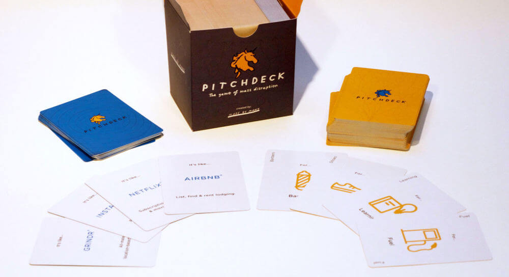
Introducing Pitchdeck – the game of mass disruption
Want to “do” innovation? Here's a way of bringing fun into the process. At the end of last year we released Pitchdeck – a card game that brings play into ...

Design
Avoiding the monster truck problem
Some Working principles in designing for an older audience

Hiring: Full Stack Developer (London)
We’re looking for a full-stack Ruby on Rails developer to join our engineering team in London.